p5.js: Algorithmic Design

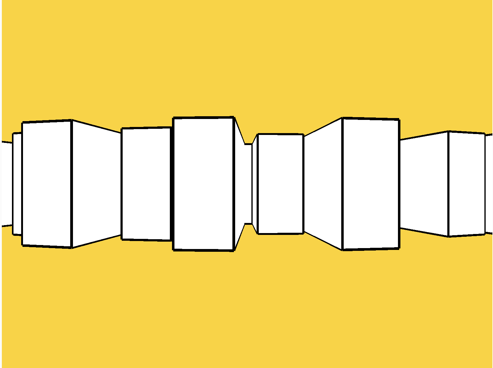
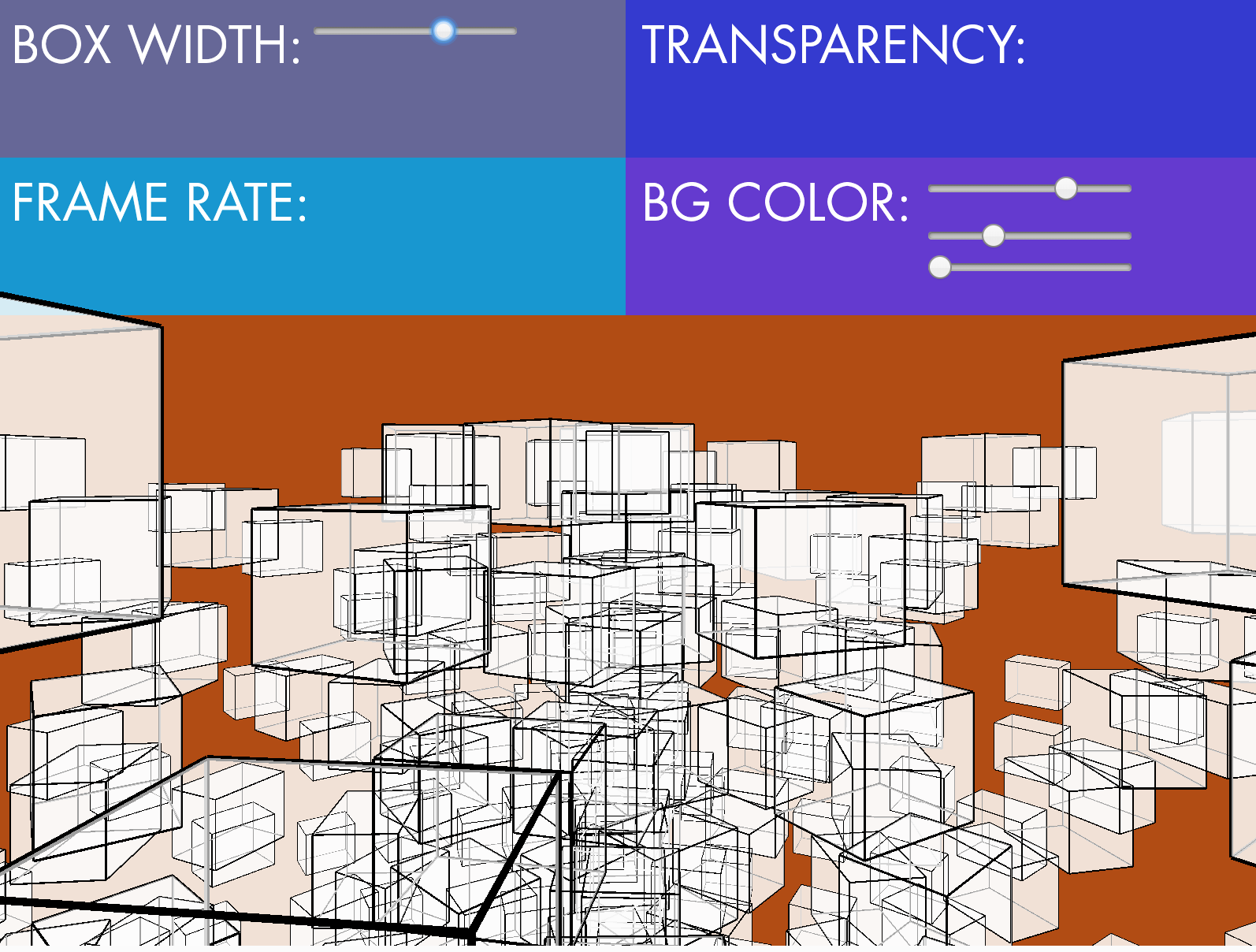
Dawn and I partnered up to create a spiraling array of boxes with adjustable parameters. The box width, transparency, frame rate, and background color are the elements with values that exist within a range, controlled by a series of sliders.

p5js_algdes.gif


As a starting point, we looked through Kelly De Naples' sketches, which could be found here: https://editor.p5js.org/denaplesk2/sketches. We came across one in particular titled: Exercise 4: Functions_Circles, which could be found here: https://editor.p5js.org/denaplesk2/sketches/ryIwGqZsf.

To understand her algorithmic design, we explored each line of code step by step. We wanted to break down her exercise into digestable, individually controlled elements. We changed a whole slew of parameters, and turned her pattern grid of jostling circles into a 3D environment of cubes.

Screen Shot 2019-09-24 at 8.21.24 PM.png
Screen Shot 2019-09-24 at 8.14.32 PM.png

At first, we were confused why the boxes appeared stacked on top of another, especially when there were two for loops to create both rows and columns of the boxes. We quickly realized that within WEBGL, a push / pop / translate were required to ensure that each box would shift as the variable x and y increased within the for loop.

Another point of confusion was why the boxes were being drawn in the center of the canvas we defined. It is a result of the default camera angle. We had tried changing the values of different parameters, but instead we used the top portion to create our User Interface for adjustable sliders. I think for a future iteration, it would be interesting to create an additional slider that controls camera angles.

Screen Shot 2019-09-24 at 10.22.05 PM.png

Observation: Taco Bell's Self-Service Kiosk

The other day, I listened to this episode of the podcast Hidden Brain - You 2.0: Decide Already! and I thought that I could apply it to the lesson I learned observing a public interactive technology.

When you’ve made an irrevocable decision, you rationalize it. Once something’s gone and gone forever, the mind gets to work figuring out why what it got is really better than what it lost.

But when a decision isn’t irrevocable, when you can remake it, and revisit it and change your mind any time, what do you do? You just ruminate about it, right? You buy a sweater, and you know you can take it back any time. And every time you put it on, you look in the mirror and you think, oh, I don’t know. Maybe it’s not a good fit. Maybe it’s not a good color. Maybe I ought to bring it back. On the other hand, if this sweater was bought at a place that won’t take it back, you look in the mirror and you say, gosh, that looks good.
— Daniel Gilbert, Psychologist. Source: NPR.org

This week, I wanted to observe people using the Taco Bell’s self-service kiosk. I made the assumption that people gravitate towards the kiosk to steer away from human interaction and preserve anonymity, maybe to avoid the shame of ordering way too much food after being presented all of the available options. The line for the kiosk might look shorter at times, but it doesn’t necessarily mean you will get your food any faster. There might be the thought that using this technology would be much more efficient, resulting in a quicker transaction. I find that when I use it, I discover new ways of customizing the order, thus taking a much longer time to use it, and I order much more than I originally intended. There are so many different pages of the menu to navigate through, the amount of options becomes way too overwhelming, and after experiencing decision fatigue, I pick things “just to get it over with.”

I went to Taco Bell at what I thought was a prime lunch hour, 12:30 - 1:15pm. I sat at the table closest to the kiosk with the best viewing angle of the touch screen so that I would be in a prime location for observing other customers using at least 1 of 2 kiosks.

To my surprise, no one completed a full transaction at the kiosk in my 45 minute visit. Regardless of a 5-6 person line, all of the guests walked right past the kiosk and straight to the cashiers. One person started to flip through the menu and spent 56 seconds navigating before he sort of shook his head and went back to staring at the menus above the cashiers.

IMG_3675.JPG
IMG_3677.PNG

My observation of the self-service kiosk will be based on my own roughly 4-minute transaction from start to finish. The part that took the most time was deciding how to customize an item after the very long process of finding that item. In my case, I flipped through each menu to find the new Toasted Cheddar Chalupa. I was very unfamiliar with all of the ways you could customize the taco, simply fascinated with all of these sauces I never knew were available or even already included in things that I’ve eaten there several times. For my value menu nachos, I was unaware that the sauce that was included was dubbed “red sauce” - what even is that? I added the “popular add-ons:” seasoned beef, tomatoes, onions, and reduced fat sour cream.

The part that took the least amount of time was the first binary question: the decision to dine in or take out at the very beginning. The other seemingly straightforward question within the transaction was choosing a method of payment, but it had three separate screen interactions. It asked me how I would like to pay and I selected Cash, however it then prompted me to rethink my decision by stating that cash payments are made at the front counter. Perhaps by principle, I wanted to avoid the counter and complete the transaction entirely at the kiosk. After selecting debit card, it then activated the adjacent card reader and I proceeded to insert my chip. I then opted to receive my receipt via text.

Even though I completed my transaction at the kiosk, there was still confusion of which order belonged to whom. The employee called my name, and the tray I received contained a burrito and a hard taco instead of the chalupa and nachos I ordered. No matter where you order it, whether it is at the cashier, kiosk, or online, it falls within the same mix of orders and can just as easily be mistaken with another customer.

What I learned was that people are much more likely to approach the counter because of its quicker transaction as a result of withholding all of the available options in front of you. It’s not the most important decision you have to make when all of the food you order is affordable - there isn’t too much to lose if you make the “wrong” choice. Reflecting on the quote at the beginning of this blog led me to think that people are much more happy making a final decision and receiving closure when a human hands you the receipt to end the transaction. I believe that the self-service kiosk can be helpful for those with specific dietary restrictions, or are very particular and familiar with all of the ways an item can be customized.

IMG_3667.JPG

Analog Input / Output

To demonstrate an analog input / output, I wanted to use an ultrasonic distance sensor and map its values to the angle of a servo motor. With this very simple configuration, I used it to create a wave generator.

To elevate the idea, I wanted there to be two servos on either side of the water channel so that the waves can collide.

Screen Shot 2019-09-21 at 6.35.55 PM.png


p5.js: Animation, Variables

We are only in our third week of school, but the feeling of new stresses has largely accumulated. I began looking for inspiration in any moment I had a chance to breathe and step out of my thoughts. I sought out a humble escape across the street, and parked in one of those red lounge chairs in the middle of the MetroTech campus. With proper posture for that lounger, I became square with the overcast sky, quietly blanketed with a paper-thin leafy canopy.

I wanted to replicate the subtle breathe of these leaves that barely created shelter from an impending drizzle. I began the assignment by looking at two Recursive Tree examples:

I enjoyed the natural, unpredictable length of branches of the first example, and the interaction of growing branches of the second.

With uncertainty of how to create abstracted leaves and avoiding a direct figurative translation, I began exploring trunk widths through the expression of multiple cylinders. The width was mapped to the mouseX position.

Screen Shot 2019-09-14 at 2.16.46 AM.png
Screen Shot 2019-09-14 at 2.19.29 AM.png

I scrapped this visual and wanted to focus on the breath, not just of these greens but mostly of my own. I envisioned a multicolor mandala composed of layering shapes that would undulate as you exhale. Using the mic, your “breath” or voice controls the rotation of the shapes Z axis. The mapped breath value, mouseX and mouseY coordinates control the R, G, B values of the fill.

Click here to view the sketch.

Make a Switch: ITP-linko!

For this assignment, we were tasked to create a switch. Introducing…

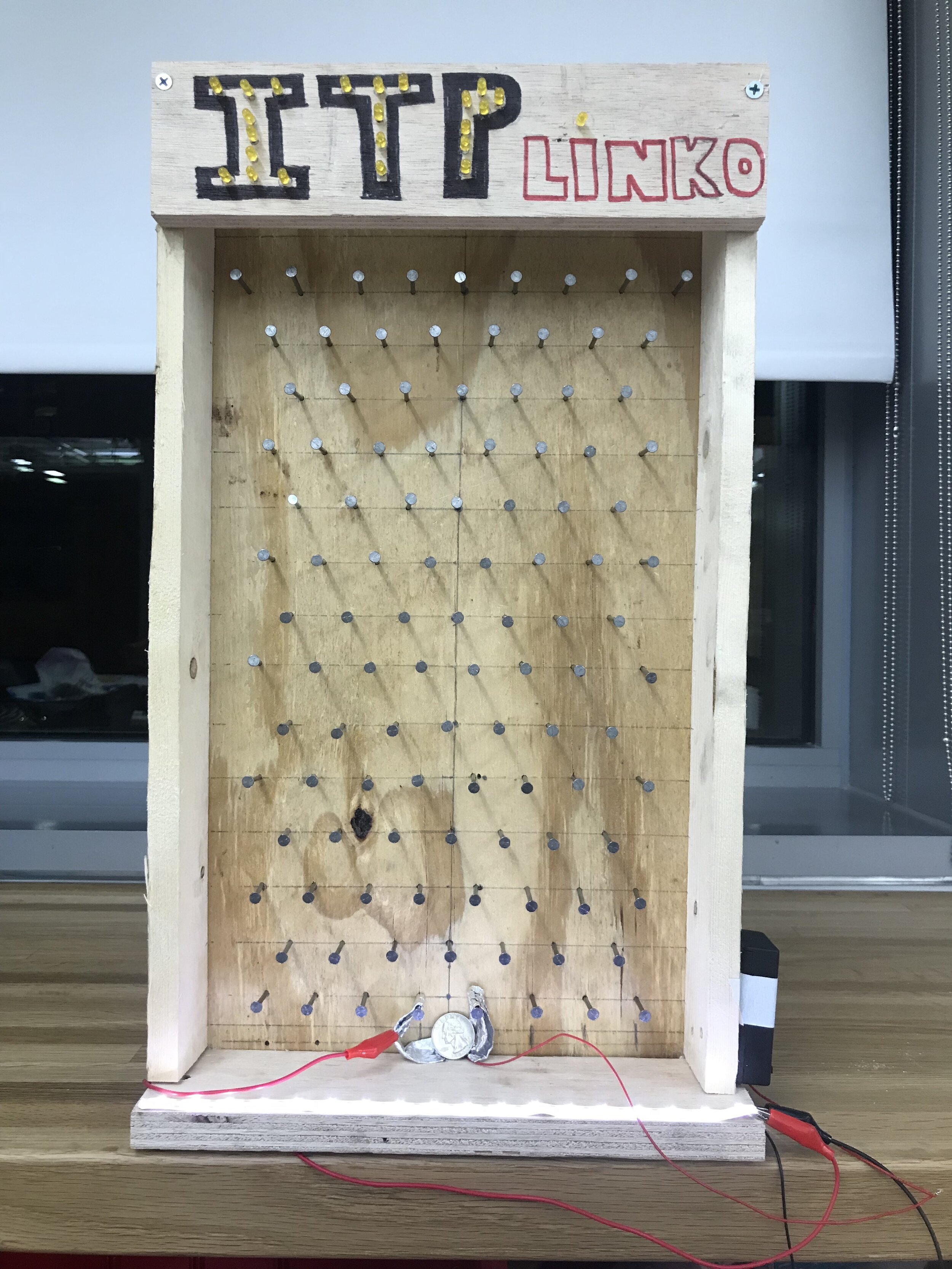
Completed ITPlinko circuit

Completed ITPlinko circuit


ITP-linko!
Drop a quarter at the top - you might just be the next winner! In order to activate the white LED strip at the bottom, the quarter must drop into the winning slot to complete the circuit.


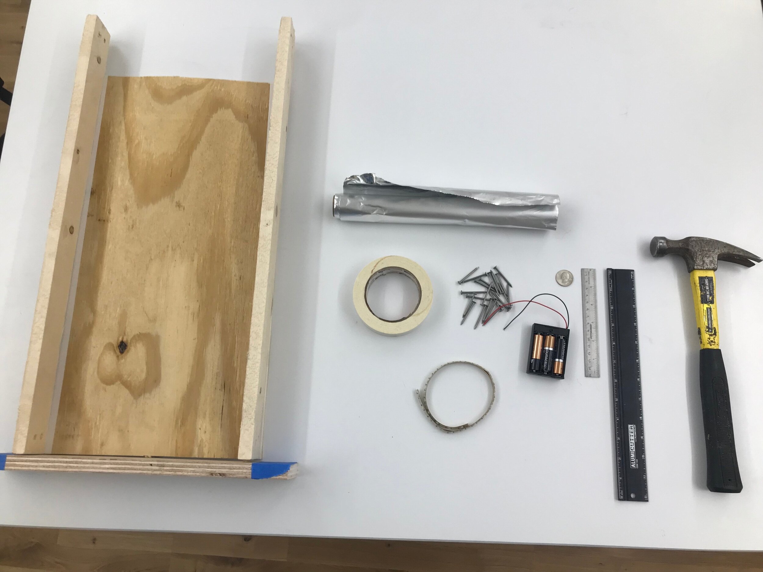
ITPlinko Materials:

IMG_3573.jpg
  • Found wood

  • 1-1/2” nails

  • Battery pack

  • (3) AA Batteries

  • LED Strip

  • Aluminum Foil

  • Quarter


Process:

  1. Gather wood and trim to size

  2. Drill pilot holes in wood and screw in side and bottom borders

  3. Map out nail placement in game board

  4. Hammer in nails to create the quarter’s obstacle course

  5. Connect battery pack’s ground wire to ground of LED strip.

  6. Create foil sections that will need to be connected in order to act as a switch to complete the circuit.

  7. Connect battery pack’s power wire to one foil section. Connect other foil section to LED strip’s power contact.

  8. Turn on battery and drop in your quarter!


switch01.gif

Week 1: Light Effect

Over the years, I have made it a personal mission to accumulate materials that can be used to shape, distort, contain, diffuse or otherwise transform light. Here is a material that I’d like to continue exploring.

I took this video on April 9, 2019 at 2:33 AM, a typical hour of my night when I am kept awake by the sheer spark of curiosity for a new material. I am demonstrating the effects of overlapping two lenticular lenses to manipulate three different Philips Hue colored light sources within my bedroom in their existing locations. The magenta bulb is located on the left side of my desk in an exposed clamp light; the spring green bulb is positioned on the right side of my desk on a lamp with no shade; the periwinkle light is actually located behind me in the video towards the left, also on a clamp light. I found the effects to be striking, very evocative of emboldened neon lighting as if these LED bulbs were instantly transformed into tubes infused with swirling inert gas. The properties of the lenticular lens are both reflective and magnifying, shaping the light that is not just directly behind it but also the ambient sources within the room. The lens is an array of a cylindrical ridges molded into the plastic - when the ridges are vertical, the light is stretched horizontally. However, when the ridges of the second layer are no longer aligned with the first, there is almost a wispy, aurora-like quality. I played around with the distance between the two layers, made them convex / concave, and observed how bendable the light became.

I purchased these lenticular lenses to create a series of shadowboxes, initially intended to create moving images with photographs of my friend Christina Lan that were taken by Anjelica Jardiel. The goal was to create this lenticular image or “analog gif,” which would be illuminated with addressable LEDs controlled by madMapper. Within the frame, the lenticular lens created this linear rhythm that caused the portrait to vibrate Other portraits in the series were installed with one-way mirror film, so that the image would be revealed when the LEDs would be activated.

Album Cover for Laenz’s EP litno. Graphic by Laenz. Photography by Anjelica Jardiel

Album Cover for Laenz’s EP litno. Graphic by Laenz. Photography by Anjelica Jardiel

For more images of this installation, please view them on my Instagram: https://www.instagram.com/p/B1G4rrSlnLr/

p5.js: Screen Drawing

When assigned to create any sort of screen drawing with p5.js, I thought to pull inspiration from modern art. We reviewed the classic programming example of Sol LeWitt’s Wall Drawings, where a museum, gallery, or other space simply receives a set of instructions of how to create the artwork. I thought I would pick a random Sol LeWitt work, and I came across this prompt for the Boston Museum:

Random points on a canvas that are not evenly spaced.

Random points on a canvas that are not evenly spaced.

I started working on the code for this: https://editor.p5js.org/niccab/sketches/fmrRtWck1

I paused after making the random points and came up with the conclusion that this set of instructions might be better suited for Week 6’s class on arrays. My code only creates 50 random dots without any concern of where each dot is in relation to another, therefore, it would not be evenly spaced across the canvas. Furthermore, in order to connect the random, evenly placed points, I would need to store their coordinates in an array.

My question then might be, is there a way to randomly place dots that are evenly spaced? If the spacing is defined and each point has consideration for its neighbor, is the coordinate of the point truly random?

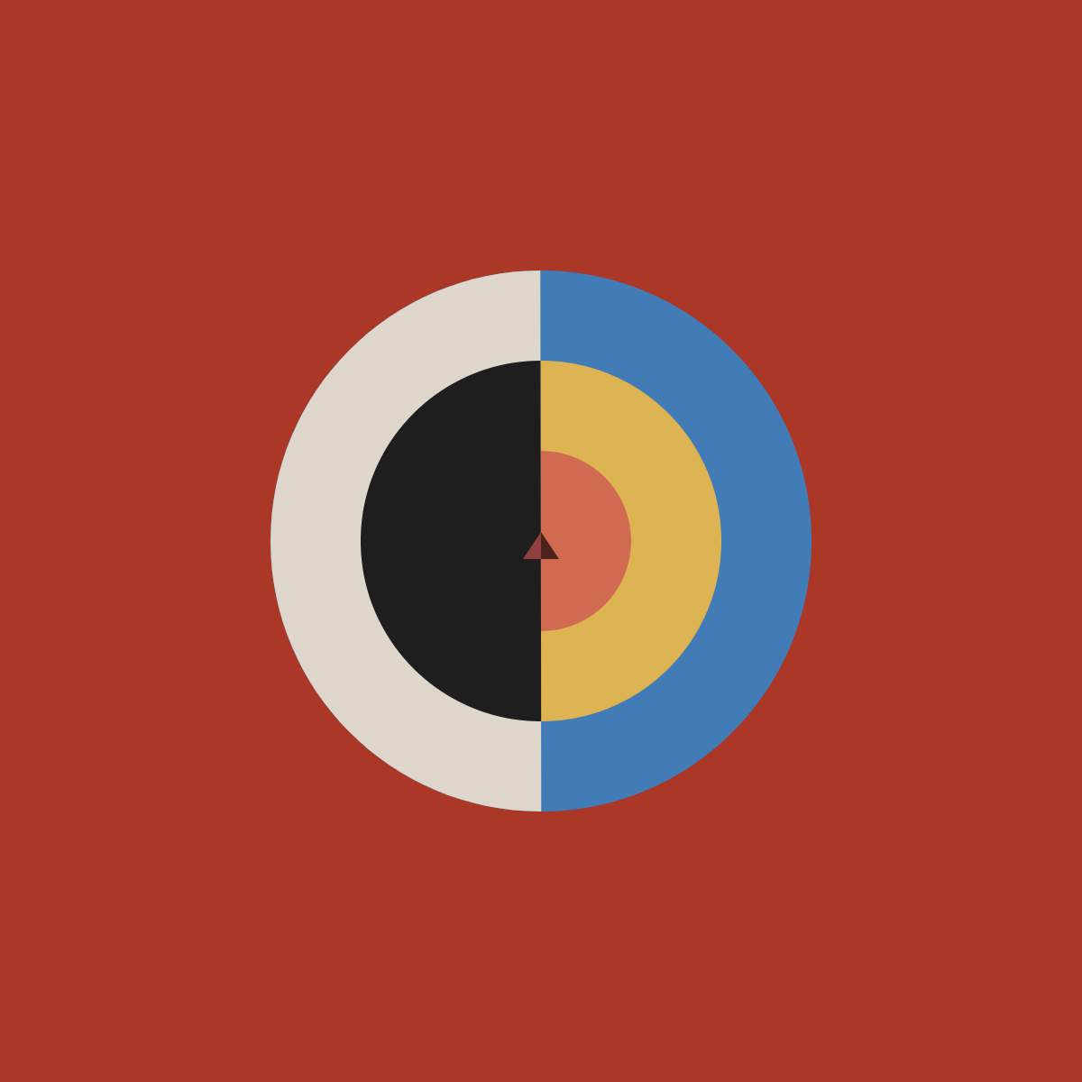
I thought a bit further about what we had discussed in class, and I remember that one of the example questions was “how do you use the arc function and define its parameters?” Still inspired by paintings, I wanted to replicate Hilma Af Klint’s Svanen.

p5.js replica of Svanen.

p5.js replica of Svanen.

Here is the p5.js sketch: https://editor.p5js.org/niccab/sketches/Fci2SMXje

When making this, I did get a bit confused using the arc function. Of course after a bit of trial and error, I figured out how to place the coordinates. Is there a particular reason why an arc starts to draw clockwise beginning east? Why not north? Is there a way to define the arc with degrees instead of radians?

I would like to add visible brush strokes onto the p5.js version of Svanen. What might be the best way to approach an organic brush stroke overlay that follows the confines of the shape that contains it?

What Computational Media Means To Me

My background is in Visual Arts, with a focus on Architectural Photography. After I received my Bachelor’s, I realized that I fell out of love with photography. I didn’t want to hide behind the lens anymore; instead, I wanted to create the compositions of light that I once simply studied and took pictures of.

In 2014, I decided to backpack throughout Europe and Japan with the sole purpose of documenting light festivals and created this side project dubbed Square.Sky. I attended Lumina in Cascais, Festival of Lights in Berlin, Glow in Eindhoven, Fête des Lumières in Lyon, and several Christmas spectaculars scattered throughout Japan. This wasn’t JUST light - I was exposed to a cornucopia of new media: projection mapping, interactive sensors, spatial sound systems, addressable lighting, and so much more.

I have been inspired by the likes of teamLab, rAndom International, Moment Factory, Nonotak, and so many more. I have worked with ITP Alumni CHiKA on her installation SEI05, Brooklyn Research as an intern to find New Forms of Interaction, and now Leo Villareal as a technical project manager. My passion is to learn how I can manipulate light and fabricate the structures to support those interactive systems.

I see computation as a means to communicate between software and hardware to facilitate human interaction.